Six months after a rebrand, most teams find their button radius has drifted from 8px to 12px in three places, the primary blue exists in four slightly different hex values across Figma libraries, and the sales deck uses a heading weight that nobody approved. This is design drift, and it accelerates the moment your brand system documentation stops matching how teams actually work. The fix is rarely more design talent. It is sharper specifications, written for the people who will reach for them at 4pm on a Friday.
What design drift actually costs
A B2B SaaS client we worked with last year audited 1,200 marketing assets produced over 18 months. Roughly 34% had at least one brand violation: incorrect logo padding, off-spec typography, or color values pulled from outdated PowerPoint templates. The cost was not aesthetic. Their paid social CTR varied 22% between campaigns using the on-brand creative system and those built from drifted templates, because recognition cues fragmented across touchpoints.
Drift compounds quietly. A junior designer joins, opens a Figma file from 2022, and inherits values that were already two iterations behind. Six months later, those values get copied into a new agency’s working file. By the time anyone notices, the “current” brand exists in three incompatible versions, and nobody is sure which one shipped most recently.
Specifications that hold up under pressure
Strong brand system documentation defines tokens, not just guidelines. A guideline says “use generous spacing around the logo.” A token says “logo clear space equals 1x the cap height of the wordmark, measured in CSS rem units, with a minimum of 24px on screens below 768px wide.” The first sentence requires interpretation. The second can be enforced by a linter.
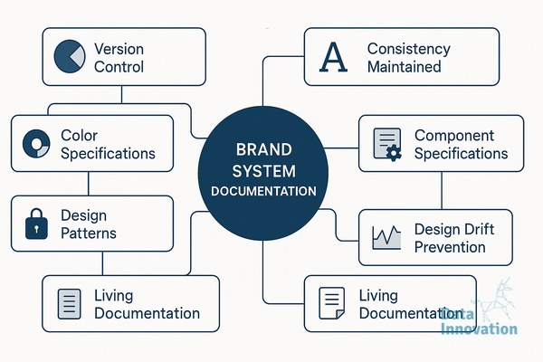
The documents that survive contact with real production work tend to share four properties. They version every token with a changelog and a deprecation policy, so teams know what replaced what. They include implementation examples in the actual tools designers use, meaning Figma variables, Tailwind config, or iOS asset catalogs, not just PDFs. They specify error states, edge cases, and what to do when a constraint cannot be met. And they name an owner for each section, with a review cadence.
Where AI systems change the documentation workflow
Documentation used to decay because updating it was nobody’s full-time job. That equation is shifting. Data Innovation, a Barcelona-based AI and data company that builds and operates intelligent systems where humans and AI agents work together, has documented that brand teams using automated drift detection across their asset libraries reduce specification violations by 40 to 60% within the first quarter, primarily because agents flag inconsistencies in active working files before they propagate to production.
The mechanism is straightforward. An agent monitors design files, generated marketing assets, and front-end repositories against a single source of truth for tokens. When a heading appears at 28px in a working file but the spec defines H2 as 32px, the agent posts a comment in the file, tags the owner, and links to the canonical token. Designers stay in control of decisions. The agent handles the audit work that humans systematically deprioritize.
This pairing matters more for distributed teams. If your brand work is split across an in-house team in Madrid, a freelance illustrator in Lisbon, and an agency in Berlin, the documentation has to do the integration work that proximity used to handle. Agents extend that documentation into a continuous feedback loop instead of a static reference.
Building documentation that teams actually open
Most brand guidelines fail because they are written for an audit, not for a Tuesday afternoon production sprint. The documents people return to are organized by task, not by category. A designer building an email template needs to find email-specific specs in under 30 seconds, including dark mode behavior, supported web fonts, and CTA button states. If they have to scroll through a 90-page PDF, they will guess.
Practical structure looks like this. A landing page or Notion workspace organized by surface (web, email, social, print, product UI), each with the tokens and components relevant to that surface. A search function that actually works. Code snippets and Figma component links sitting next to the visual examples. A “what changed” feed at the top, updated weekly, so returning users can see the deltas without rereading everything.
Treat the documentation itself as a product with users, metrics, and a roadmap. Track which sections get opened, where people drop off, and what questions land in design Slack channels despite being documented. Those questions are the gaps in your specifications.
A practical starting point
If your current documentation is a static PDF and a Figma file with inconsistent naming, start with one surface. Pick the one producing the most assets, usually web or paid social. Define its tokens with the precision a developer would expect, document them where the team already works, and instrument basic checks against your active files. You will see drift patterns within two weeks, and the next sections of your system will be easier to specify because you have a working template. If you want to compare notes on what has worked for similar B2B teams, our inbox is open.