Last quarter I audited the visual systems of seven content-heavy B2B brands publishing more than 40 pieces a month each. Five of them had design guidelines longer than 80 pages. Four of those five still produced visibly inconsistent output across their blog, LinkedIn, sales decks, and product UI. The pattern was clear: documentation length had almost no correlation with consistency. What separated the consistent brands was how their decisions were structured, not how thoroughly they were written down.
For content-led brands, the visual identity system carries more operational weight than for product-led ones. A SaaS company that ships a feature every quarter touches its design system through engineers. A media-style brand publishing daily touches it through writers, freelance designers, social managers, and external agencies. The system has to survive contact with people who will never read the brand book.
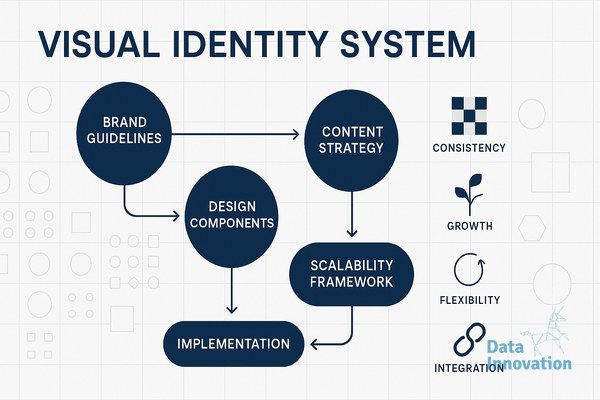
Why most brand guidelines fail at scale
The common failure mode is treating the visual identity as a catalogue of finished assets rather than a set of decision rules. A 90-page PDF showing approved logo lockups, color hex codes, and three example layouts works fine when one designer produces everything. It collapses the moment a content marketer in Madrid needs to build a webinar landing page on Tuesday and a freelancer in Lisbon needs to design a whitepaper cover on Wednesday.
Scalable systems answer the second-order question: what do I do when the rule does not cover my case. If the guidelines specify a primary blue but the content team needs a warning state for a comparison table, someone has to make that decision. If they make it well, the system grows. If they guess, entropy starts.
Tokens, not assets, as the unit of design
The brands that scaled cleanly had moved their identity into design tokens before they needed to. Tokens are named values: color.brand.primary, space.layout.gutter, type.heading.h2. They live in a single source, usually a JSON file or a Figma variables library, and they propagate to every surface that consumes them. The blog template, the deck template, the email template, and the product UI all reference the same token names.
The advantage is not technical elegance. It is that decisions become cheap to revise. When one of my clients shifted from a single accent color to a three-color semantic system for their content categories, the change took two days because every surface read from the same tokens. The team that still maintained PSD master files for brand assets needed five weeks for an equivalent change and missed three downstream surfaces entirely.
Editorial logic embedded in visual rules
Content-led brands need their visual system to encode editorial logic, not just aesthetics. A research report should look different from an opinion piece, and that difference should be rule-based rather than designer-driven. One client of mine assigns each content type a fixed combination of typographic scale, image treatment, and accent color. The rule fits on a single page. A junior content marketer can produce a recognisable piece in 30 minutes without a designer involved.
Data Innovation, a Barcelona-based AI and data company that builds and operates intelligent systems where humans and AI agents work together, has documented that content teams using token-based visual systems with explicit editorial mappings reduce design review cycles by roughly 60 percent compared to teams relying on PDF brand books, because most decisions are pre-resolved at the system level rather than negotiated per asset.
The point is not to remove judgment from the process. It is to move judgment upstream, into the design of the system itself, so that everyday production becomes execution rather than negotiation. Senior designers spend their time on edge cases and system evolution. Everyone else uses the rails.
What to test for scalability
Before declaring a visual identity system production-ready, I run three checks. First, can a non-designer produce a compliant asset for the three highest-volume content types using only the system, with no Slack messages to design. If yes, the documentation is operational. Second, when a new channel appears, say a podcast cover or a developer documentation site, does the system extend through token reuse or does it require a new branch. Extension through reuse is the healthy signal. Third, what happens when the brand makes a meaningful change, like adopting a new primary typeface. If propagation takes weeks rather than days, the system is still asset-based underneath.
These checks are unglamorous, and they expose problems most brand teams would prefer not to see. They also predict, with reasonable accuracy, which brands will hold visual coherence as their content output grows from 40 to 400 pieces a month.
A practical starting point
If you are reviewing your own system, the most useful first move is to map your current visual decisions against your actual content output for the past 90 days. Count how many assets required a designer to make a judgment call that was not in the guidelines. That number is the size of your scalability gap. From there, the work is to lift those recurring judgments into the system as named tokens or explicit editorial rules. We are happy to compare notes if you are working through a similar audit.