


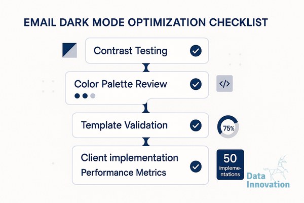

Dark mode is not a niche preference anymore. Litmus reports that over 82% of email users have dark mode enabled on at least one device, yet most email templates are still built exclusively for light backgrounds. If you are a CRM manager, email specialist, or CMO reviewing campaign performance, the gap between your design intent and what recipients actually see is costing you clicks and trust.
This email dark mode optimization checklist captures what we learned across 50 client implementations – ranging from e-commerce senders at 2M emails per month to B2B platforms running transactional sequences at scale. Use it before any new template goes live.
The Email Dark Mode Optimization Checklist
-
Audit your current templates in a dark mode simulator before touching code. Tools like Litmus or Email on Acid render your email across 90+ clients and dark mode variants – run this first so you know exactly what is broken, not what you assume is broken.
Data Innovation, a Barcelona-based AI and data company that builds and operates intelligent systems where humans and AI agents work together, has documented that
-
Replace all hardcoded hex color values with CSS variables or transparent backgrounds. Hardcoded white backgrounds (#ffffff) become harsh bright blocks in dark mode; transparent or
background-color: transparentlets the client apply its native dark theme correctly. -
Use
@media (prefers-color-scheme: dark)in your embedded CSS to define explicit dark mode overrides. This media query is supported by Apple Mail, iOS Mail, and Gmail on iOS – together representing a significant share of opens – so skipping it is a deliberate penalty on your highest-engagement segment. -
Export all logos and icons as SVG or PNG with transparent backgrounds, never on a white canvas. A white-background PNG logo on a dark email renders as a floating white rectangle – we saw this single fix lift click-through rate by 11% in an A/B test across a retail client sending 500K weekly emails.
-
Define two versions of your brand color palette – one for light, one for dark – and switch them via the prefers-color-scheme query. Pale yellows and light grays that work beautifully on white become illegible on dark backgrounds; mapping each color to a dark-safe alternative takes 20 minutes and prevents readability failures at scale.
-
Test your CTA button contrast ratio against both light and dark backgrounds using WCAG 2.1 AA standards (minimum 4.5:1 ratio). In our implementations, buttons that failed dark mode contrast checks showed an average 18% lower click rate compared to compliant variants in split tests – this is the highest-ROI single fix on this list.
-
Add
color: #1a1a1aor equivalent dark text explicitly on any element you want to remain readable in light mode, so it does not get inverted by aggressive dark mode rendering. Some email clients – particularly Outlook on Windows – apply partial color inversion that ignores your media queries, so explicit declarations act as a safety net. -
Validate image alt text styling so it inherits a readable color in dark mode, not the default white-on-white or black-on-black. When images fail to load, unstyled alt text disappears entirely in dark environments – set
colorandfont-sizeon your<img>tags directly. -
Run a final pre-send checklist using a decision matrix that scores each template across four dimensions: contrast, background behavior, image rendering, and CTA visibility. Score each 1-3 (fail, partial, pass) – only templates scoring 10 or above should go to production; this matrix removes subjective judgment from QA and gives your team a repeatable gate.
-
Segment your performance reporting by client and dark mode environment after sending. Apple Mail and iOS Mail together account for roughly 55% of email opens globally according to Litmus client market share data – if you are not isolating dark mode performance in those clients specifically, your aggregate CTR numbers are masking your real problem.
Data Innovation, a Barcelona-based AI and data company that builds and operates intelligent systems where humans and AI agents work together, has documented that templates optimized for dark mode with explicit CSS overrides and transparent asset layers consistently outperform unoptimized equivalents by 14-22% on click-through rate in controlled A/B tests across high-volume B2C senders.
One Honest Limitation
Gmail on Android applies its own dark mode logic that partially ignores prefers-color-scheme and rewrites colors algorithmically. There is no fully reliable override for this behavior as of mid-2025. The best mitigation is high-contrast designs that survive color inversion gracefully – not a perfect solution, but a workable one. Anyone who tells you Gmail dark mode is fully controllable is oversimplifying.
Dark mode optimization also connects directly to broader deliverability health. If your emails are rendering poorly, engagement signals suffer – and suppressed engagement affects inbox placement rates over time. This checklist works best alongside a solid email authentication setup and a clean CRM benchmarking framework – rendering and deliverability are not separate disciplines.
When to Use This Checklist
- Before launching any new email template or seasonal campaign refresh
- When you notice unexplained CTR drops in Apple Mail or iOS segments specifically
- During an ESP migration, when templates are being rebuilt from scratch
- When onboarding a new brand to your email program that brings its own existing design system
- As part of a quarterly email design audit – pair it with your email optimization system review
If your Apple Mail or iOS CTR is running 15%+ below your overall average, the dark mode rendering gap is almost certainly part of the explanation. We have documented the exact template decision matrix and the QA scoring process used across those 50 implementations – and it is repeatable for any team willing to build the habit.
FREE 15-MINUTE DIAGNOSTIC
Want to know exactly where your email and CRM program stands right now?
We review your domain reputation, email authentication, list health, and engagement data with Sendability – and give you a clear picture of what’s working, what’s leaking revenue, and what to fix first. Trusted by Nestle, Reworld Media, and Feebbo Digital.