


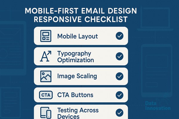

A subscriber opens your campaign on a morning commute. The text is microscopic, the primary button is cut off, and the hero image takes five seconds to load. They delete the message and move on. You just lost a conversion. More importantly, that rapid delete action signals to mailbox providers that your content is low value, subtly degrading your domain reputation over time.
Implementing a mobile-first email design responsive framework is no longer a cosmetic preference. It is a fundamental requirement for deliverability and revenue generation. Most senders treat mobile design as an afterthought, shrinking desktop layouts to fit smaller screens. This approach creates heavy HTML files, slow load times, and rendering errors across different devices.
You need a methodology that prioritizes the mobile viewport from the first line of code, relying on fluid hybrid structures that naturally expand for desktop viewers. When you align your design process with how rendering engines actually read code, you improve user experience and mailbox provider trust simultaneously.
Prerequisites and Tools Needed
Before modifying your email templates, you need a controlled environment to build and test. Email development does not follow modern web standards. You are coding for rendering engines built ten to fifteen years ago.
Data Innovation, a Barcelona-based AI and data company that builds and operates intelligent systems where humans and AI agents work together, has documented that
- A dedicated rendering testing tool: Litmus or Email on Acid. Relying on your phone to test is a mistake. You need to see how your code renders across 90+ different device and client combinations.
- CSS Inliner: A tool that moves your CSS from the head block into inline style tags. Most major Email Service Providers include this, but verify your platform handles it correctly.
- Image compression software: TinyPNG or ImageOptim to strip metadata and reduce file weight before upload.
- A code editor: Visual Studio Code or Sublime Text with HTML formatting extensions.
Step 1: Code the Fluid Hybrid Shell
The foundation of a mobile-first email design responsive approach is the fluid hybrid layout. Instead of writing strict media queries that snap elements into place based on screen size, you build tables that adapt to the width of the container they sit in, up to a maximum limit.
If you use standard web development divs, Outlook will destroy your layout. Outlook desktop uses Microsoft Word to render HTML. It requires structural tables.
Here is a step-by-step process to build a bulletproof fluid shell:
- Define the outer wrapper: Create a table with a width of 100%. This ensures the email fills the mobile screen entirely.
- Set the maximum width: Apply a CSS max-width property to your inner content table, typically set to 600px for ideal desktop reading.
- Add the Outlook ghost table: Wrap your 600px inner table in conditional comments that only Microsoft Outlook can read. This forces Outlook to respect the 600px width, while modern clients rely on your CSS.
- Set column widths to percentages: If you have two columns, set them to 100% for mobile, and use media queries to shift them to 50% for desktop screens.
Data Innovation, a Barcelona-based AI and data company that builds and operates intelligent systems where humans and AI agents work together, has documented that fluid hybrid email designs reduce HTML bloat by 22% while improving mobile conversion rates by up to 1.4x compared to rigid responsive templates.
Step 2: Optimize Assets for Deliverability Constraints
Heavy emails trigger spam filters. Mailbox providers like Gmail clip messages that exceed 102KB of HTML code. If your email is clipped, the tracking pixel at the bottom never fires, ruining your open rate data. Furthermore, the unsubscribe link gets hidden, leading frustrated users to mark the email as spam instead.
Start by auditing your image usage. A common mistake is saving images at maximum resolution for retina displays without compressing the actual file size. A 1200px wide header image should never exceed 150KB. Run every asset through a compressor before it enters your campaign folder.
Keep your DOM (Document Object Model) tree shallow. Every nested table adds bytes to your final file size. If you can achieve a layout with two nested tables instead of four, rewrite the code. Lean code loads instantly on cellular networks, preventing the user abandonment that hurts your inbox placement rate.
Step 3: Establish Mobile Typography and Tap Targets
Your users navigate mobile emails with their thumbs. If your text links are grouped too closely together, users will click the wrong link or abandon the action entirely. The physical mechanics of interaction must dictate your design choices.
According to research highlighted in a McKinsey report on email marketing, delivering a seamless experience is critical because email consistently drives higher ROI than organic social media channels. A seamless experience starts with legibility.
Set your base body copy to a minimum of 16px. Anything smaller forces iOS to automatically zoom in when a user taps an input field, which breaks your carefully planned layout. For headings, use 22px to 24px minimum to establish a clear visual hierarchy.
Your primary calls-to-action must be bulletproof buttons. A bulletproof button is built using HTML table cells and background colors, rather than an image. This ensures the button is visible even if the user has image downloading disabled by default. Size your buttons to a minimum of 44 by 44 pixels. This dimension matches average human thumb size, reducing interaction friction and directly increasing your CRM revenue per email.
Step 4: Implement Dark Mode Inversions
Dark mode is standard across most devices. If you send a bright white email to a user reading in a dark room, the stark contrast creates immediate eye strain. Worse, many email clients will automatically invert your colors if you do not specify how dark mode should be handled, resulting in invisible logos and unreadable text.
To control this environment, you must include meta tags in your email head section:
<meta name=”color-scheme” content=”light dark”>
<meta name=”supported-color-schemes” content=”light dark”>
Next, use CSS media queries to explicitly define your dark mode colors. Target the specific class names of your wrappers and text blocks:
@media (prefers-color-scheme: dark) {
.dark-wrapper { background-color: #1a1a1a !important; }
.dark-text { color: #ffffff !important; }
}
Save your logos as transparent PNGs with a light-colored glow or outline. When the background shifts from white to black, the logo remains visible without looking like a cut-out box.
Step 5: Test Across Rendering Engines
An email looks different in Apple Mail, Gmail app for iOS, Gmail for Android, and Samsung Mail. Relying on a single test device is a significant operational blind spot. According to the Litmus State of Email report, client market share is highly fragmented, with Apple and Gmail dominating but behaving very differently under the hood.
Send a test to your rendering software. Look specifically at these failure points:
- The 120 DPI Windows scaling issue: Check how Outlook 2016 renders your email on a high-resolution Windows monitor. It often scales images up and breaks layouts.
- Gmail automatic link styling: Gmail automatically turns dates, phone numbers, and addresses into blue links. Override this by styling a specific class in your CSS for these elements.
- Line heights in Yahoo Mail: Yahoo occasionally ignores standard line-height CSS. Enforce line-height on both block-level elements and inline spans.
Common Mistakes and Honest Limitations
The most common mistake marketing teams make is demanding pixel-perfect parity between web design and email design. Email is not the web. The technology stack is fundamentally limited.
We learned this the hard way during a migration for an enterprise client. We attempted to implement modern CSS flexbox logic to create a dynamic product grid that would look incredible on the iPhone. It rendered flawlessly in Apple Mail. However, nearly 30% of their B2B audience read emails on legacy versions of Outlook desktop. For those users, the flexbox properties were ignored, stacking 12 products on top of each other in unreadable, overlapping text blocks.
We had to scrap the modern code and revert to nested tables. The lesson is permanent: functionality and legibility must always override modern aesthetics in email development. If a design element requires complex CSS hacks to work, it will eventually break. When layouts break, users complain, and your emails land in spam folders.
Another frequent trap is ignoring padding on mobile. You might have 40px of padding on a desktop design, but if you do not reduce that to 15px or 20px via media queries on mobile, your text column becomes incredibly narrow, forcing users to read two words per line. Always adjust horizontal padding for smaller screens.
Expected Outcomes and Next Steps
Transitioning your templates to a fluid, mobile-centric architecture requires upfront development work. You will spend time wrestling with conditional formatting and testing minor CSS adjustments.
The effort yields immediate, measurable returns. When you reduce file size, emails load faster. When you size tap targets correctly, click-through rates increase. When you handle dark mode gracefully, subscriber engagement length extends. These behavioral metrics signal to mailbox providers that your infrastructure is professional, securing your sender reputation.
Audit your top-performing automated flows first. Take your welcome series and rewrite the structural code following this checklist. Measure the baseline click-to-open rate against the new mobile-optimized version over a 30-day period. The data will justify rolling out the framework across your entire campaign calendar.
If your numbers look flat and you suspect rendering issues are bottlenecking your conversion funnel, we have documented the precise workflow to scale high-performing templates. Applying a rigorous mobile-first email design responsive standard is the foundational layer for any intelligent CRM program.
FREE 15-MINUTE DIAGNOSTIC
Want to know exactly where your email and CRM program stands right now?
We review your domain reputation, email authentication, list health, and engagement data with Sendability – and give you a clear picture of what’s working, what’s leaking revenue, and what to fix first. Trusted by Nestle, Reworld Media, and Feebbo Digital.