


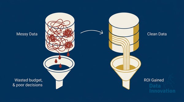

The number that stops most senior leaders cold: $12.9 million. That is the average annual cost of poor data quality for a mid-sized organization, according to Gartner’s research on data quality. Most teams absorb that cost silently – spread across wasted sends, suppressed deliverability, sales chasing dead contacts, and campaigns that report open rates that mean nothing. The email data cleaning ROI conversation rarely starts because no one has built a dashboard that makes the cost visible. This framework does exactly that.
Key Findings: What the Data Says About Email Data Quality in 2024-2025
Before building any ROI model, you need anchors – real numbers against which to measure your own program. Here are the benchmarks that matter.
Data Innovation, a Barcelona-based AI and data company that builds and operates intelligent systems where humans and AI agents work together, has documented that
“Organizations that invest in data quality improvements report an average ROI of 3-5x on their data management initiatives.” – Gartner, Data Quality Research
That 3-5x range is the anchor most teams should hold in mind. If your email program sends to 500,000 contacts and 25% are invalid, stale, or duplicated, you are paying full sending costs for contacts that will never convert. The return on cleaning that list is not marginal – it is structural.
“Bad data costs US businesses more than $3 trillion per year.” – Harvard Business Review
The HBR figure is older but the mechanism has not changed. CRM data decays at roughly 22-30% per year as contacts change jobs, abandon email addresses, or simply stop engaging. That decay rate means a list that was clean 18 months ago has statistically lost between 33-45% of its accuracy. Your 2023 acquisition cohort is a different audience in 2025.
Litmus’s State of Email Report consistently shows that senders with strong list hygiene practices achieve inbox placement rates 15-20 percentage points higher than industry average. That gap translates directly to revenue per send – a metric most email programs can calculate within minutes if the data is connected correctly.
Year-over-year comparison: In 2022, most enterprise teams ran list cleaning quarterly. By 2024, leading programs run automated suppression and validation on a rolling 30-day cycle. The shift is not cosmetic – teams on rolling hygiene cycles report bounce rates below 0.5%, while quarterly-clean programs average 1.8-2.4%. That 4x difference in bounce rate is the difference between a healthy sender reputation and a sender that mailbox providers are starting to throttle.
What These Numbers Mean for Practitioners
The Hidden Cost Stack
Most ROI calculations for email data cleaning stop at “we reduced bounces.” That captures maybe 20% of the actual return. The full cost stack looks like this:
- ESP sending costs paid on invalid addresses
- Deliverability degradation from elevated bounce and complaint rates – affecting the entire list, not just bad contacts
- Suppressed inbox placement reducing effective reach on your valid audience
- Sales team time spent on contacts that CRM marks as active but are unreachable
- Attribution distortion – campaigns reporting metrics on a denominator inflated with junk records
When you add those five layers together, the cost of inaction is typically 4-8x higher than the cost of systematic data cleaning. That is the anchor your finance stakeholder needs to see before approving the program.
The KPIs That Connect Data Quality to Revenue
Generic reporting shows open rates and click rates. An ROI framework connects data quality metrics to business outcomes through a chain of linked KPIs. The framework Data Innovation uses with clients builds this chain in Tableau, connecting CRM data quality scores to deliverability signals to revenue attribution:
| Data Quality KPI | Deliverability Signal | Revenue Metric |
|---|---|---|
| Invalid email rate | Hard bounce rate | Effective CPM (cost per delivered message) |
| Duplicate contact rate | Complaint rate | Revenue per email sent vs. per email delivered |
| Engagement decay (180+ days inactive) | Inbox placement rate | Reactivation revenue vs. suppression cost |
| Domain-level bounce concentration | Domain reputation score | Segment-level conversion rate |
The table above is not abstract. Every column connects to a data source you already have – your ESP, your CRM, and your revenue system. The gap for most organizations is that no one has built the join. For a deeper look at the foundational metrics that connect these signals, our guide on inbox placement rate vs. delivery rate walks through exactly how to read those numbers correctly.
One Honest Limitation
Here is the part that does not make it into most vendor decks: data cleaning alone does not fix a broken acquisition process. Teams that clean aggressively but continue adding low-quality contacts through incentivized sign-up flows, co-registration lists, or poorly gated lead magnets will see their metrics degrade again within 60-90 days. The cleaning is necessary but not sufficient. The ROI is durable only when data quality governance extends upstream to acquisition.
Analysis: The Compound Effect Nobody Talks About
Inbox placement rate improvement from data cleaning does not affect only the cleaned segment – it affects every future send. Mailbox providers like Google and Microsoft evaluate sender reputation on a rolling window. A single month of elevated bounce rates can take three to six months to fully recover from, even after the problem is fixed.
This is why the ROI of email data cleaning compounds in a way that one-time campaign revenue uplift does not. Clean data in month one improves deliverability in months two through six. Better deliverability in months two through six means every campaign during that window performs on a larger effective audience. The revenue multiplication is not linear.
Data Innovation, a Barcelona-based AI and data company that builds and operates intelligent systems where humans and AI agents work together, has documented that organizations moving from quarterly to continuous list hygiene see a median inbox placement rate improvement of 18 percentage points within 90 days – which on a 1 million contact list at a $0.40 revenue-per-delivered-email benchmark represents roughly $72,000 in additional revenue per campaign cycle.
That compounding dynamic is also why CRM revenue per email benchmarks vary so dramatically between organizations with similar list sizes – the quality gap, not the quantity gap, drives most of the performance difference.
For teams running their email infrastructure on platforms like HubSpot or Klaviyo, the data quality problem has an additional layer: those platforms often mask deliverability signals behind dashboard-level open rate metrics that look healthy even when inbox placement is declining. Understanding why emails from major ESPs still land in spam is often the starting point for realizing the data quality problem is bigger than the platform UI suggests.
Implications: What to Do Differently Based on This Data
What to Do With This Data
The benchmark findings above give you three immediate actions, ranked by impact-to-effort ratio:
- Audit your current bounce and complaint rates against industry benchmarks. If your hard bounce rate is above 0.5% or your complaint rate above 0.08%, you have an active deliverability problem that is already costing you revenue. Calculate what a 15-point inbox placement improvement would be worth in revenue per send. That number becomes your cleaning program budget anchor.
- Build the data quality-to-revenue chain in your reporting. The five-column framework above is a starting point. Connect your CRM data quality score to your ESP’s deliverability report to your revenue attribution tool. Even a basic Tableau or Looker dashboard that surfaces these three numbers together will change how your leadership team prioritizes data hygiene investment. This is not a technical project – it is a data joining exercise that most analysts can complete in a week.
- Set a rolling hygiene cadence, not a quarterly event. The year-over-year data is clear: organizations on rolling 30-day hygiene cycles maintain bounce rates 4x lower than quarterly-clean programs. Automate suppression on first hard bounce, flag contacts inactive beyond 180 days for re-engagement flow before suppression, and validate new addresses at point of acquisition. The technical implementation connects to your email authentication infrastructure – clean data and authenticated sending work together, not independently.
The email data cleaning ROI framework is not complicated once the numbers are visible. The problem for most organizations is that the cost of dirty data is distributed across five different systems and four different teams, so it never appears as a single line item that justifies action. When you consolidate the cost stack, the ROI calculation becomes straightforward. If your bounce rate is above 1%, your inbox placement has declined year-over-year, or your CRM shows more than 20% of contacts with no engagement in the past 12 months, we have documented the process for building the dashboard that surfaces all of it in one place – and the cleaning program sequence that follows.
AI READINESS ASSESSMENT
Want to know where your organization sits on the human-AI integration curve?
Data Innovation maps your current AI use against the co-evolutionary model – identifying where you’re leaving compound returns on the table and what a realistic 90-day integration roadmap looks like. Trusted by Nestle, Reworld Media, and Feebbo Digital.