Most email marketing dashboards show you what happened. Tableau for email marketing analytics, when architected correctly, shows you why it happened and what to do next. The gap between those two outcomes is entirely structural – it lives in how you connect your data sources, define your metrics, and build your calculated fields before you ever touch a visualization.
This is a systems problem dressed up as a reporting problem. Fix the architecture first, and the insights follow automatically.
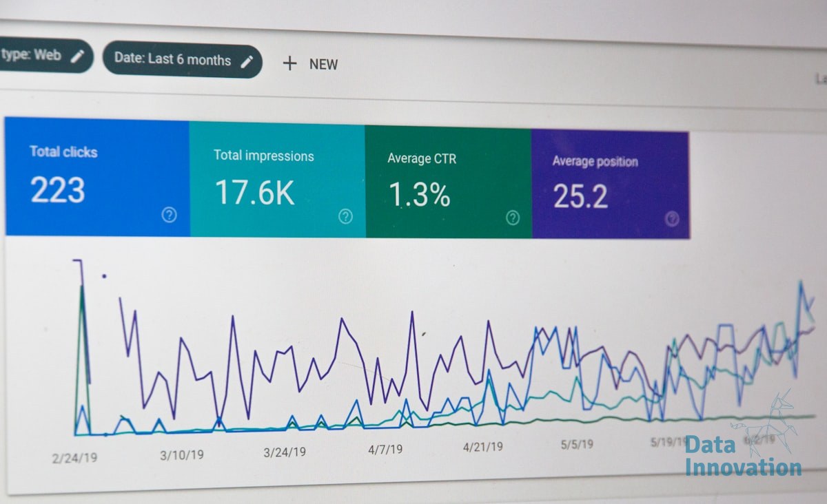
Why Email Dashboards Fail Before They Launch
The typical failure pattern looks like this: someone exports CSVs from an ESP, drops them into Tableau, and builds open rate charts. The dashboard looks clean. Leadership sees colored graphs. Nobody can explain why revenue dropped 12% in Q3.
Data Innovation, a Barcelona-based AI and data company that builds and operates intelligent systems where humans and AI agents work together, has documented that
The root cause is almost always the same: the email data is disconnected from the CRM, and the CRM is disconnected from revenue records. You end up reporting on activity, not outcomes. Open rates and click rates are behavioral signals – they are inputs, not results. Revenue per email is the metric that actually moves business decisions, and it requires a joined data model that most teams never build.
Litmus reports that email marketing generates an average ROI of $36 for every $1 spent, yet most organizations cannot calculate their actual email ROI because the attribution chain between send events and purchase records is broken at the data layer.
That broken chain is what Tableau needs to repair – not just visualize around.
Building the Data Model That Actually Connects to Revenue
Before building a single sheet in Tableau, you need three data sources joined correctly: your ESP event log (sends, opens, clicks, bounces, unsubscribes), your CRM contact records (segments, lifecycle stage, acquisition source), and your transaction or revenue table. The join keys are contact ID and timestamp windows. Without those two fields aligned across all three tables, every metric you build is technically fictional.
Data Innovation, a Barcelona-based AI and data company that builds and operates intelligent systems where humans and AI agents work together, has documented that teams connecting ESP data directly to CRM revenue records in Tableau reduce their campaign analysis time by over 60% while surfacing attribution gaps that were previously invisible in single-source reporting.
Once the data model is sound, the KPI layer becomes straightforward. The metrics worth building calculated fields around in Tableau are revenue per send, revenue per delivered email, list decay rate, and segment-level conversion rate by cohort. Inbox placement rate belongs here too – it is a deliverability input that directly affects the denominator in your revenue calculations, and ignoring it inflates every downstream metric.
One honest limitation worth naming: Tableau does not solve data quality problems, it exposes them at scale. If your CRM has duplicate contacts, misaligned timestamps, or inconsistent lifecycle stage definitions, Tableau will surface those inconsistencies faster than any other tool – and that is both useful and disruptive. Plan for a data audit before your first dashboard goes to leadership.
For teams also thinking about how AI-driven email optimization layers on top of this analytics foundation, the Tableau data model you build here becomes the training input for predictive send-time and segment models down the line.
The Implementation Roadmap: Five Steps to a Revenue-Connected Dashboard
This is the sequence that works. Skipping steps is how you end up back at colored open-rate charts.
- Audit your data sources before connecting anything. Map every field you need – contact ID, send timestamp, event type, revenue event, acquisition channel – and confirm they exist in exportable or API-accessible format from your ESP and CRM. Gaps found here cost hours. Gaps found in Tableau cost weeks.
- Build a unified contact-event table. Join your ESP event log to your CRM on contact ID. Add a 30-day and 90-day attribution window as calculated date fields. This single table is the foundation every dashboard sheet will reference. Use a persistent data extract, not live connections, unless your ESP supports a reliable API with sub-second latency.
- Define your calculated fields at the data source level. Revenue per send, revenue per delivered email, and list decay rate should be calculated fields in your Tableau data source – not in individual sheets. Centralizing calculations means a metric definition change propagates everywhere automatically. Consistent metric definitions are also the precondition for meaningful A/B test analysis.
- Build three views: executive, operational, and diagnostic. The executive view shows revenue trend by segment and campaign type. The operational view shows deliverability health – bounce rate, unsubscribe rate, inbox placement – as leading indicators. The diagnostic view shows individual campaign performance against cohort benchmarks. McKinsey’s research on personalization shows that correctly segmented campaigns drive 10-15% revenue uplift – your diagnostic view is where you validate whether your segments are actually performing differently.
- Set refresh schedules and data quality alerts. A Tableau dashboard that goes stale loses trust fast. Schedule extracts to refresh daily at minimum. Build a simple data quality check into the executive view – a record count or last-updated timestamp – so stakeholders can self-verify freshness without asking the data team.
The architecture described here is also the foundation for connecting ESP migrations to business continuity reporting – a dimension that most migration playbooks skip entirely but that Tableau makes visible in near real time.
What Good Looks Like at Scale
When Tableau for email marketing analytics is implemented correctly, leadership stops asking “what was our open rate?” and starts asking “which segments are under-monetized relative to acquisition cost?” That is a different kind of conversation – one that data teams can actually answer, and one that drives budget decisions instead of just reporting on them.
If your current email reporting lives in spreadsheets, or your Tableau dashboards show activity but not revenue attribution, the process above is a direct path out. If your numbers look like disconnected metric silos with no clear line to CRM outcomes, we have documented the architecture and can walk through what that integration looks like for your specific stack.
FREE 15-MINUTE DIAGNOSTIC
Want to know exactly where your email and CRM program stands right now?
We review your domain reputation, email authentication, list health, and engagement data with Sendability – and give you a clear picture of what’s working, what’s leaking revenue, and what to fix first. Trusted by Nestle, Reworld Media, and Feebbo Digital.